


Following our class discussion of Bruce Pennington's work, here are the developments of the tutorial, inspired by that discussion.
In most cases, before embarking on a drawing that has a number of components and scenery, I produce small , rough layouts.


For the purpose of this tutorail, I have kept to rough A4 layouts and crudely shaded the images in photoshop. This is purely due to lack of time due to other work commitments. I intend to produce inked versions some time in the not too distant future. For now though, use this tutorial as a guide only.
In fact, use everythynig I post here or discuss in class as a guide only.
Always question and find your own solutions when creating your work.
Below are some further explorations into other possible layouts.

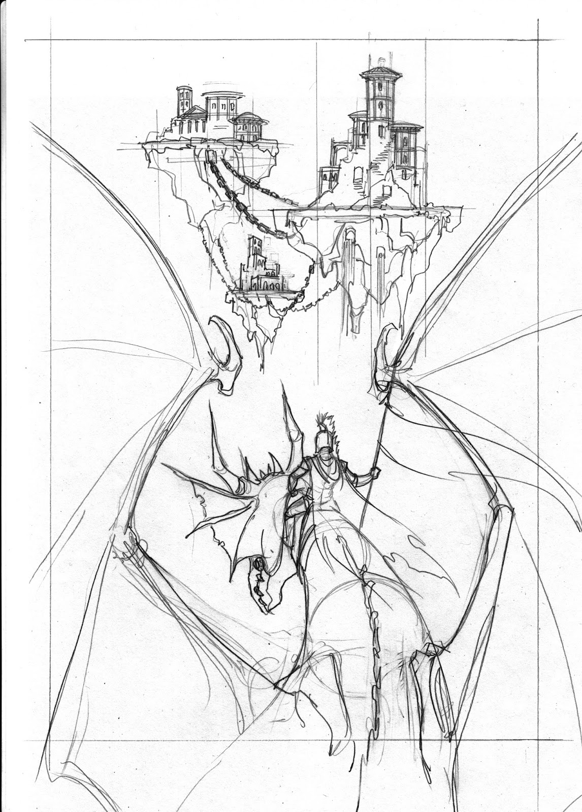

Here is the layout I chose to continue with

Notice the pov is looking up at the floating building , and dwon upon the guy on the dragon, therefore the building is above the horizon line, and the guy on the dragon is below.
Consider the possibilities of how this layout may be developed using tone and lighting.
How would you chose to approach developing this layout?
Below are a couple of suggestions


Are the tonal values in the back gorund too close to the ones in the foreground?
Does this kill the illusion of distance between the forground and background?
By adjusting the density of the background tones, does it help create an illusion of distance?

No comments:
Post a Comment