Friday 28 June 2013

Sarah Nowell

You may remember we discussed drawing hair a week or two back, and the various ways to go about it, well Sarah Nowell  (Sarah attended the class some time ago) posted a really nice piece of work on facebook this week. I think she should have been running the class that week.
Excellent work Sarah. 

Wednesday 26 June 2013

ARTIST OF THE WEEK

Well actually, it should read, artist's of the week, because I was most impressed by both, Abdulrahman's and Jake's, efforts  this week. Both have applied themselves and made  progress. Before I display examples of the aforementioned student's work, I have something I would like to post about my class.

I was asked this week if the class is only for hopeful amateurs wanting to break into the business. The answer I gave was, "No, it's for anyone who wants to apply themselves and have fun drawing fantasy art regardless of their current level of drawing ability". A large percentage of students who enroll have little or no experience of drawing. Sometimes I have wondered if  a basic drawing class would have been better suited to their needs but as they had been drawn to my class through an interested in fantasy art, I saw no reason why my class could not provide the same guidance as a basic introductory drawing class while at the same time allowing them to pursue  themes  within fantasy art.

To be honest, it's a real mixed bag of students. Some are students at Leeds College Of Art,  some are professionals wanting to try out something different, for others it is a release from the pressures of everyday life, whether that be a job that they are sick off, health issues (mental or physical). But I would say for a large percentage it is also, very much as social thing. Having said that, I have coached two students in getting a portfolio of work ready to take to Thought Bubble (Leeds' very own comic convention) , which resulted in them coming away with a business card from Steve Whacker (Marvel Comics Senior Editor) and later begin correspondence with  Marvel talent  coaches.  All you really need to attend my class (apart from the fees, which are nothing to do with me) is the willingness to apply yourself. If you do not posses that, then all the art gadgetry in the world will not make you a better artist . You will only get out of  the class what you are prepared to put in.

One final thing I would like to get off my chest is regarding the hindrance of an individual's artistic / creative development. I had an art student attend my class. I think he was attending just for some extra drawing experience. After a couple of weeks I noticed a smaller sketch book, on the corner of his table, that he wasn't using. I asked if I could look through it and  I found within some really amazing work. I told the student that I thought  this work is exceptional and why had he not shown me it before now. He replied, informing me that one of his main art tutors had told him to stop wasting his time and hat what he was producing had no merit. I was gobsmacked! And  angry. I could tell that this  was a natural  and truthful expression of ideas  from the student as an artist. What's more, it was very good work. The look of relief on the student's face  at having his work accepted was reward enough for my entire time teaching. I find it hard to believe that an art tutor would hinder a student's development in such a way and  I will stop teaching the day I  am  found guilty of such actions (If any students past or present feel that this is the case, I really do need to know, so please make it known)  . The student in question is Daniel Antony Newton (I hope he doesn't mind me mentioning his name), and I really do hope he has gone on to follow his dreams and achieve great things. He is very talented.

Ok, back to  two students who have definitely applied themselves. Abdulrahman (Dahmi)
The drawing on the left shows Dahmi's very first attempt in class. 6 (or so) hours later, as the drawing on the right shows, Dahmi is making progress with anatomical structure. Dahmi came to the class with  no drawing experience.

More evidence of Dahmis' progress. Keep pushing forward Dahmi. Good work.

Jake also made some substantial progress with his figure work.

This is not to suggest the other students have not applied themselves, I think it's safe to say that good work is being produced by all.  Tamsin is currently  producing a piece I am looking forward to see finished.

Remember, the most important thing is to have fun drawing and I hope my class allows this to happen.

Tuesday 25 June 2013

#ART #FUNDRAISER #LANEGAN #QOTSA #NICKCAVE #BATMAN #STARTREK

I am doing another fundraiser for asylum seekers in the UK. I will be doing a sketch a day available to buy at a very low price for a limited time only. The fundraiser will end on the 30th July.
The gallery of art is on facebook. The account is public so everyone should be able to view it. If you encounter any problems or have any questions you can e-mail me here: flameboy_1@ntlworld.com
All details on how to buy these sketches and donate to a worthy cause can be found on the page.

Here are some examples.
Batman

Mark Lanegan

P J Harvey


#ART #FUNDRAISER #LANEGAN # HARVEY #ELVIS #BATMAN #QOTSA

Sunday 23 June 2013

WEEK#7: SEA CREATURES PART 3

As I mentioned in class, I am not going to take you all the way through this one, I really want to encourage you to go your own way with this. For those of you who may need help with the tentacles, I am posting some reference material and also some examples of how other artists have drawn them.
Here are some photo references of tentacles that I grabbed from the net.


Here are some artistic renderings.
Here's one, by  Travis Lewis, that I particularly like.
Check out his work  here
There is some really nice work on there. Go check it out.


The way Mike Mignola draws tentacles has always been a favourite of mine.


One of the main things to  remember is to not draw the suckers aligned symmetrically. Study the photos above, notice that they are different sizes and that they are like feelers reaching out in all directions.


Here is my final pencil and ink wash drawing.


Wednesday 19 June 2013

WEEK#7: SEA CREATURES PART 2

I get asked a lot about how to hair  and I have  noticed it can be a stumbling block for some students, so, l will start this post by looking at various ways of drawing hair.
Drawing hair should pose a problem, the best way I have found is to not over complicate things and keep to simple flowing shapes to start with.
As I mentioned a few posts ago, I learned to draw hair by following the early Disney artists and comic book artists such as Alex Toth.

Bruce Timm is another good  example of how to simplify hair with maximum effect.
To students just starting out, I always recommend  to stick to a few simple flowing shapes.
Once you have established the desired look by using simple outlines you can then add shading and highlights. The folds of hair that curve towards the light will have a lighter tone, if not a bright sheen, and the hair that curves away from the light will be darker or possibly solid black, depending  on the colour of the hair and the intensity of the light source. It's not rocket science.

On the image below I have added a little more shading. If this were blonde  hair, the highlight  may possibly  stretch a wider area, darker hair, such as brunettes,  may only allow smaller areas.

For something more complex, it is simply a case of creating smaller, layered shapes.

The more shapes you have, the more  contours you will have to deal with in relation to light and dark areas as they will each  be affected by the light at different points.


Below are more examples of how I approached drawing hair. Remember, this is just to show how I achieved  the look I was after. You may find another approach by another artist that suits you, or you may find it all by yourself. I am only giving you an example, it should not be taken as "the" way.


Here is a good example of how to draw hair by Xia Taptara . It says pretty much everything I have been saying in class.
Check out the over clips  by  Xia Taptaria, he has some really informative tutorials  available.

Below are examples of more complex hair arrangements but they are achieved in exactly the same way as shown in the examples and video above.


Ok, I think that enough for you all to chew over for now. I will post the final part for this exercise later this week, so remember to check back soon.


Tuesday 11 June 2013

WEEK #6: SEA CREATURE. PART 1

I may update this post with text at a later date but for now I will just throw up these images. You all know what was discussed in class:
" For the next 4 weeks  I  do not want you to get hung up about following my tutorials exactly how I draw them (it might not be right for you) or measuring  your progress by any one elses, just  judge your own progress. The most important thing is to have fun drawing."


Below I have separated the arrangement of tentacles using different colours just so you can follow  the layout easily. Of course, you can create your own layout , which may better serve your drawing..


Below is a close up of the face. I think I have posted enough regarding drawing the face without going into detail here.


Below I have quickly identifies the solids and lighter tones using  photoshop. This is an example only, please feel free to explore other lighting arrangements.


Notice that I have left plenty of light surrounding the figure, so that it is not lost in the background tones.


Wednesday 5 June 2013

WEEK # 5 A LESSON LEARNED THROUGH BAD DRAWING.

What you are about to read is not only a recap of the most recent class but also  an account of  how lost I had become as an illustrator.
Note to my students: Please note that  I refer to my drawing as being bad due to the fact that I know I can draw better, DO NOT judge your own drawings  at the same level, especially if you are just starting out.  
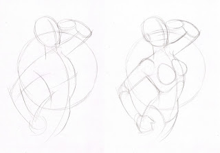
Following on from the recent figure drawing exercises  I wanted to continue with a tutorial that would focus on the human form , that would be easy to follow and result in a composed piece of work.
I recently drew a sketch of someone I know  and posted it on facebook. It was just a quick, loose sketch, just for the fun of it. 
 The idea for the sketch was inspired by Alberto Vargas pin-up girl art and the application of such art on the body of  WW2 aircraft. This, I fetl, was an  appropriate theme, due to this person having a  fondness for the style and clothing of the 40's-50's .


 This theme also reminded me of Philip (80's airbrush king) Castle's work


While drawing the sketch, I thought it would also make a good Barbarella themed piece, so I set about producing something that could be used as a tutorial. This is when my troubles began.
As some of you may be aware, Barbarella, is a French/Italian science fiction film based on  Jean-Claude Forest's comic book character. In the film, Barbarella is played by Jane Fonda. 


As I am a fan of the movie, I wanted to draw a Jane Fonda Barbarella. The thing is, I would not class myself as a portrait artist. I can get a likeness sometimes and, when I do, I consider it a pure fluke.

I think that because I was trying to capture a likeness of a real life person, I was allowing theprocess to influence the style of drawing and the results were appalling. Ok, maybe I'm being too harsh, but I was very disappointed with every effort I produced. One after another of continuous bad drawing.

Below are some sketches of Jane Fonda.  These are really bad. I am showing these just to prove that some professional artists have bad drawing days (of which I have many).
The images below, chart the  doomed journey to epic failure.
It starts off reasonably well, though I think the leg arrangement could have been better, and then plummets to disaster.


 I then continued to produce a rough colour scheme in photoshop.

I think the end result is  unflattering, lifeless and lacks  good aesthetic.
I thought that maybe trying to capture Jane Fonda's likeness was getting in the way, so
 I attempt the drawing again, but this time, try to capture Jane Fonda's likeness. The result is a slight improvement but I was still unimpressed by my effort.


And then  I remembered that I had produced a Barbarella drawing for a class back in 2009.

This drawing was produced on a flip chart  using  a black marker. I drew it a stage at a time while the students followed. This was before Swarthmore went all digital and projectors and stuff.
 This is how I generally draw when I draw concept art for toys or cartoon shows, and have done for many years. It's possible that, through some kind of insecurity,  I deviated from my path when I became aware of Bruce Timm's work and how close it was to mine, ...only much better. I guess I was  self conscious about  being seen as a Bruce Timm wannabe and began to draw less and less in the style that felt so natural to me. I think this was a big mistake. I am not a comic book artist. I have illustrated  some graphic novels but I am not a comic book artist in the true sense of the word. I am a fan of Bruce Timm's work and have been ever since he created the style of Batman: The Animated Series.


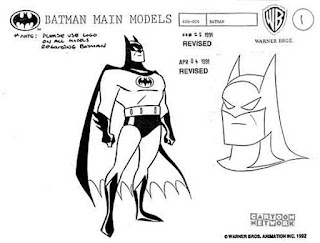
I did not become totally aware of his comic book work until much later, at which point I felt a bit second rate. 

The real influence behind the way I drew stuff was actually , Hanna Barbera cartoons ,


and Alex Toth comic book art.


So, I  attempted the drawing again, this  time drawing without thinking about it and this is what came out on paper....


Below is a rough colour scheme for the background I threw on in photoshop  as I had run out of time before I left to go teach my class.


By not trying to force something that was not one of my strengths, that being a portrait artist, and by shrugging off  any self conscious baggage about producing something similar to another (much better) artist I produced a sketch that looked more relaxed and natural, and in only 60 minutes (including scanning the stages etc).
I hope I have learned not to get so hung up about my work and whether it looks like another artist's work, and just draw.