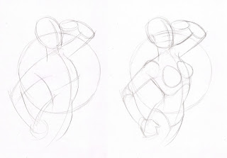
What you are about to read is not only a recap of the most recent class but also an account of how lost I had become as an illustrator.
Note to my students: Please note that I refer to my drawing as being bad due to the fact that I know I can draw better, DO NOT judge your own drawings at the same level, especially if you are just starting out.
Note to my students: Please note that I refer to my drawing as being bad due to the fact that I know I can draw better, DO NOT judge your own drawings at the same level, especially if you are just starting out.
Following on from the recent figure drawing exercises I wanted to continue with a tutorial that would focus on the human form , that would be easy to follow and result in a composed piece of work.
I recently drew a sketch of someone I know and posted it on facebook. It was just a quick, loose sketch, just for the fun of it.
The idea for the sketch was inspired by Alberto Vargas pin-up girl art and the application of such art on the body of WW2 aircraft. This, I fetl, was an appropriate theme, due to this person having a fondness for the style and clothing of the 40's-50's .
This theme also reminded me of Philip (80's airbrush king) Castle's work
While drawing the sketch, I thought it would also make a good Barbarella themed piece, so I set about producing something that could be used as a tutorial. This is when my troubles began.
As some of you may be aware, Barbarella, is a French/Italian science fiction film based on Jean-Claude Forest's comic book character. In the film, Barbarella is played by Jane Fonda.
As I am a fan of the movie, I wanted to draw a Jane Fonda Barbarella. The thing is, I would not class myself as a portrait artist. I can get a likeness sometimes and, when I do, I consider it a pure fluke.
I think that because I was trying to capture a likeness of a real life person, I was allowing theprocess to influence the style of drawing and the results were appalling. Ok, maybe I'm being too harsh, but I was very disappointed with every effort I produced. One after another of continuous bad drawing.
Below are some sketches of Jane Fonda. These are really bad. I am showing these just to prove that some professional artists have bad drawing days (of which I have many).
The images below, chart the doomed journey to epic failure.
It starts off reasonably well, though I think the leg arrangement could have been better, and then plummets to disaster.
I then continued to produce a rough colour scheme in photoshop.
I thought that maybe trying to capture Jane Fonda's likeness was getting in the way, so
I attempt the drawing again, but this time, try to capture Jane Fonda's likeness. The result is a slight improvement but I was still unimpressed by my effort.
And then I remembered that I had produced a Barbarella drawing for a class back in 2009.
This drawing was produced on a flip chart using a black marker. I drew it a stage at a time while the students followed. This was before Swarthmore went all digital and projectors and stuff.
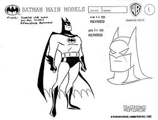
This is how I generally draw when I draw concept art for toys or cartoon shows, and have done for many years. It's possible that, through some kind of insecurity, I deviated from my path when I became aware of Bruce Timm's work and how close it was to mine, ...only much better. I guess I was self conscious about being seen as a Bruce Timm wannabe and began to draw less and less in the style that felt so natural to me. I think this was a big mistake. I am not a comic book artist. I have illustrated some graphic novels but I am not a comic book artist in the true sense of the word. I am a fan of Bruce Timm's work and have been ever since he created the style of Batman: The Animated Series.
I did not become totally aware of his comic book work until much later, at which point I felt a bit second rate.
The real influence behind the way I drew stuff was actually , Hanna Barbera cartoons ,
and Alex Toth comic book art.
So, I attempted the drawing again, this time drawing without thinking about it and this is what came out on paper....
Below is a rough colour scheme for the background I threw on in photoshop as I had run out of time before I left to go teach my class.
By not trying to force something that was not one of my strengths, that being a portrait artist, and by shrugging off any self conscious baggage about producing something similar to another (much better) artist I produced a sketch that looked more relaxed and natural, and in only 60 minutes (including scanning the stages etc).
I hope I have learned not to get so hung up about my work and whether it looks like another artist's work, and just draw.


.jpg)
.jpg)

.jpg)

.jpg)
.jpg)

.jpg)
.jpg)
.jpg)


.JPG)
.JPG)


No comments:
Post a Comment