Wednesday, 13 July 2011

End of Term Review

Well done everyone for your commitment and hard work this term. If for some of you, the progress might seem small, just remember that each term is only 10 weeks and it is all down to how much time you spend drawing in between classes that will determine your progress.
But as we discussed on Tuesday, you all have made notable progress and that's the main thing to focus on.

Ash
I think you have some good ideas and I hope you develop the confidence to explore those further. I didn't want to post any of your character designs here in case anyone takes them to develop further for themselves.
I suggest you continue with these concepts and work them through. Continue to focus and your figure drawing and these concepts will be all the more powerful for it.

Gary
Your work is slowly starting to show signs of maturity. Keep this up. Focus on your figure drawing. If you got chance to do a life drawing class, that may also help your development.

Keith
Nice biro sketches.
I think your recent pencil work is your best so far. Your comic panels are coming along nicely - but I think you still need to focus on anatomy especially hands and foreshortening. Looking forward to watching your oil painting progress.

Mohammed

Good effort this term and good progress.
If you can, try to fit in more practise with your figure drawing. Nice work on Week 10's exercise so far.

Orazio

Good work this term.
As mentioned in class, I think your own ideas produce your strongest work. So I hope you develop confidence to explore more of your own ideas.

Stacey

Consistently solid work this term, but I think that following the exercises too closely is conflicting with your own natural style.
As I mentioned in class - stay true to the style that is more natural to you, that is a truer extension of yourself and you will make great progress.
You just need to develop focus and discipline to get a decent body of work produced.

...and finally
Here is the completed drawing for this weeks exercise.

As you know I cannot upload the development stages as these are to be published later this year in a book (which I will post details of later).

Tuesday, 12 July 2011

Bernie Wrightson

I was introduced to Bernie Wrightson's work back in the 70's reading SWAMPTHING. I wish I still had those comics. What attracted me to Wrightson's work was the same thing that attracted me to Mike Ploogs work. In my mind they were the masters of the macabre as far as comic books were concerned (I am sure some one out there will want to contest  who was the greatest at horror comics, but I stand by Wrightson).Wrightson's work had a big affect on me, although I don't think it is evident in my work..
But what really blew  me away was his work Frankenstien
You can read about it here
For those who are not aware of his work I thought I would post some plates from this book. I don't have time today to elaborate on the quality of his work , but  just looking at it makes me feel inadequate in my own drawing skills.


you can buy the book here
There are many videos of Wrightson on youtube, so go watch and  learn from the master.

Friday, 8 July 2011

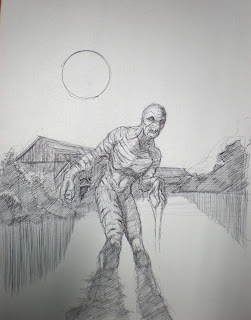
Week 9 - Flukeman Haunts Armley Canal

Continuing the theme of using existing environments as backgrounds to place the weird and freaky, this exercise (which is done with coloured paper and 2 markers) uses a stretch of Armley Canal that runs under the iron bridge on Canal Road. There is a really interesting derelict timber structure on the canal bank which has a kind of creepy look about it.


And I thought it would be perfect to use as a back drop for my favourite X-files monster, Flukeman.


This drawing was produced on some blue card/paper using Faber Castell pitt artist brush pens, and ultra marine marker and a cool grey 5 marker and white gouache ( or a pentel correction pen).

Fig 1
Start by plotting the layout. The vanishing point will disappear right off the right hand side of the page.

Fig 2
Start to define the body shape and develop the face. Roughly sketch out the shape of the bushes and begin constructing the building.

Fig 3
Begin to add detail to the skin. The skin is kind of worm/maggot like and saggy in places.

Fig 4
Shade in the areas to be solid black. The shading on the figure is a bit of a cheat as given the position of the moon, the figure would be mostly in shadow, but as the background will have a lot of solid dark areas, the figure will stand out more if it has significant areas of light.


Fig 5
A Faber Castell Pitt artist brush nib pen was used to ink this drawing.

Fig 6
An ultramarine copic marker was used for the sky.

Fig 7
A cool grey 5 copic marker was used for the mid tones. Notice how by applying them to the background helps throw out the flukeman figure while at the same time still keeping some interesting detail in the background.

Fig 8
Permanent white gouache was used to create the highlights. A pentel correction pen will do the job just as well!


Finally...
Here is the same building drawn by Lolita Zhang, you can find her on my friends list on Facebook. I think her drawing is spookier than mine! She has some other nice building sketches posted on Facebook in her random sketch album - go check them out! (You may have to ask nicely - I'm not sure they are all on public view)