Exercise 5 Part 2
For those of you wishing to complete , revise or redraw the final exercise of this term here is a recap.
For those of you who missed last weeks class on 7th December, this post provides a conclusion to the exercise that began in last weeks post.
Step 8
In the previous post the light source was established, in this case from below, and the appropriate shading was applied.
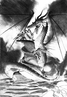
You will notice that the drawing has been adjusted. The dragon's wings are now fully extended and the ground details have changed slightly. The ground is now made up of broken rock and molten lava, creating the main source of light.
Step 9
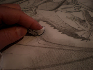
Here the darker areas have been blended in with the lighter areas by carefully smudging the layers. If you are planning on doing the same, make sure the tissue is clean or if you are using your fingers, make sure they aren't greasy, or it will produce a grease stain that will be near impossible to remove.
Step 10
Once you have finished shading and blending, create the final highlights using an eraser and tidy up the outer lines, giving more definition to your figure work.
Feel free to e-mail me your results at flameboy_1@ntlworld.com or post them on facebook and I will comment back.
Have a great Christmas and it will be great to see you all next year.
I am a professional illustrator, providing illustration for books, magazines, posters and (rock band) merchandize . I also storyboard for film, tv, video games and tv ads. Teaching is just something I enjoy doing. Just an attemp to give something back. Not everything I post here will necessarily work for everyone.
Wednesday, 15 December 2010
Thursday, 9 December 2010
September-December Week 9 07/12/10
Exercise 5
This exercise will incorporate composition, figure drawing, lighting and storytelling.
As always with these exercises, I began with a series of thumbnails to help decide the point of view of the image.
Although thumbnail 1 (above) is very dynamic and intense, I felt it was not going to allow you to develop other areas such as landscape and a narrative, so I pulled back for a wider shot.
In thumbnail 2 (above) we can clearly see that the hero battling the beast has ended up on the top of a ruin of which there is no easy escape and we can also see the terrain he has battled through, and also there is evidence of possibly, previously failed attempts at slaying the beast..
With his composition, the image can also be cropped tighter to cut out the landscape and give a shorter narrative.
I also considered the benefits of the dragon having his wings wrapped around the battle area or fully splayed out.
I will leave it to you which version to follow. You will notice further down that I have drawn the wings folded, but I have since decided to have them fully opened, so if you decide to do otherwise, refer to the thumbnail. Part 2 of this exercise will show the revised wings.
Step 1
Loosely sketch out the rough shapes that compose the image.
It may help to draw a faint vertical centre line to help balance the shapes.
Step 2
Still keeping the line work loose at this stage, sketch out the limbs of the dragon and mark out the spiral steps.
Step 3
Try not to rush the steps as this could spoil your drawing. Take time to plot them. They don't have to be technically precise, because they are part of a ruin and show decay, but they want to look convincing so keep the spaces in proportion.
I have also added a rubble of skulls and bones as a device to lead the viewer into the scene. This however is optional.
Step 4
Here the dragon has been defined.
Step 4 (Detail)
Here is a blown up version of the warrior so you can get the muscle detail.
Step 5
Now establish the light source.
In this case the light source is from below.
Friday, 3 December 2010
STAR STUDENT OF THE WEEK
I am very impressed with Vanessa's work this week.Vanessa, I wish you had the confidence to produce more of this work in class. I know you have it in you to produce this standard of work every time. Please keep believing in your ability to do this.
September-December Week 8 30/10/10
Exercise 4 Pt 2
Step 10
Step 11
Step 13
Step 15
Step 8
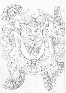
Once the basic line work for the drawing has been created, it is a good idea to review the work in order to make any last minute changes. At this stage the Faun’s horns have been reconsidered and mystical chart diagrams have been added for interest. The charts are loosely based in magic circle and astrology charts but with a bit of artistic license thrown in.
Step 9
The main light source for this drawing will come from below so everything towards the top will be dark and the highlights will appear on the lower parts of the figures. Before the background shading is created, the lighting for the main figures will be established.
Step 10
Once the light source has been established, the background tones can be applied.
Step 11
Some mid range tones have now been added by gently shading in and around the white areas and blending into the darker areas.
Step 12
Darker areas are now strengthened by adding an extra layer and also some harder lines for definition.
Step 13
A stronger, crisp hard line has been added to the outline of both characters to help define their shape against the various tones of shading.
Step 14
Step 14
Strengthen the line work using the magic charts by carefully running a pencil over the top. Make sure the point is sharp. A HB should be adequate for this part.
Step 15
Add highlights by using a fine edged eraser and carefully erasing areas where the light would fall.
Friday, 19 November 2010
September-December Week 7 16/11/10
I know that most of you (if not all) got everything down so I'll just post the final stage for the first part of this exercise and some of the reference for the faun's horns.
If the reference material of the ram's horns inspires you go a different route then feel free.
Most impressed with Sarah's dragon figures. Check her out on http://www.facebook.com/album.php?profile=1&id=117994084904059#!/pages/Sarahs-Arty-Bits-/117994084904059
If the reference material of the ram's horns inspires you go a different route then feel free.
Most impressed with Sarah's dragon figures. Check her out on http://www.facebook.com/album.php?profile=1&id=117994084904059#!/pages/Sarahs-Arty-Bits-/117994084904059
Bumper Blog (Backdated to April 2009)
Sept/Dec Course 2010 - 9th December Pt 2
In the second part of this weeks blog we'll look at applying single source lighting to a figure.
The first couple of pictures take you through constructing the figure.
I guess this is kind of standard daylight. The main light source coming from the left.
Here we have lighting coming from below
This image shows the figure in moonlight. The moonlight is simply catching the outline of the figure leaving the larger part of the body in shadow.
Although these sketches are in pencil, maybe try these exercises in ink as it will produce a cleaner contrast.Sept/Dec 2010 Course Week 6 09/11/2010
LightingBefore we move onto the exercises from week 6, let's look at Mike Mignola's drawing of Hellboy's Abe Sapien.
This is a good example of a single light source. Notice how Mignola is not conerned with showing every detail of the figure and allows the areas in the shadow to blend into the background. Also look at Frank Miller's Sin City work for similar examples.
Here is a more detailed Study of the head from week 4&5's exercise.
The first few images will run you through the construction of the head.
Step 1
Step 2
Step 4
Here we have the face lit from
the side...
...from above...
...and from below.
These images are not complete as I have not finished the hair. These images are mainly focusing on the face with an indication of how it will affect the hair.
Part 2 will be posted tomorrow.
DON'T FORGET!!!THOUGH BUBBLE FESTIVAL 18TH-21ST NOVEMBERHAVE YOU GOT YOUR TICKET YET?
LOOK OUT FOR:-JOHN ROMITA JR MASTERCLASS 13.15-14:30LEEDS ART GALLERY, HENRY MOORE ROOM.
DIDIER CRISSE WILL ALSO BE THERE AMONG OTHERS
- Week 5 02/11/10 Tutorial 3 Pt 2
- Here is a brief recap of part 2 of tutorial 3.
1. Apply the background before shading the figure. This will help you decide where best to add highlights when you begin work on the girls costume and hair etc.
2. Using an eraser, cleane up the web threads.
3. When shading the hair, use soft strokes first to create a mid range tone.
4. Apply darker strokes over the lighter areas to build up darker tones. Try not to press down too hard.
5. Carefully apply a thin crisp outline around the highlights to add definition to the figure.
6. Here is the finished piece.
7. If you have any graphics software such as photoshop or coral draw, you can have fun by scanning the drawing and adjusting the contrast and colour tones. F/A Sept-Dec 2010 - week4 - 19th Oct
Ok,as I am mega busy this week, this will have to be a quickie.Good work tonight from everyone.Here is a recap of where you should be with this exercise.
Here's an outstanding work from Orazio, Simon and Stacey.
Good work. Keep it up.
No class next week. Swarthmore will be closed for half term.See you all again on 2nd November.
F/A Sept-Dec 2010 - week3 - 12th Oct (Part 2)
Really impressed with Orazio and Sarah's work this week.
One of Orazio's latest pieces shown below kind of evokes that 50/60's pulp sci-fi cover that has influenced movie posters and comic book covers.Also there is almost a kind of Frazetta feel to the composition.OarazioFrank Frazetta
Some promising new students this term. I really like Sarah's work, she has a nice bold style and good use of colour.
Stacey has a nice clean style and an eye for detail. I am looking forward to seeing some good developments in her work.F/A Sept-Dec 2010 - week3 - 12th Oct
Ok, so, first blog of the September course. It feels like ages since I last blogged here.
So, as promised, here are some images to refresh your memory regarding the stuff we discussed and practised in week 3.
Bruce Timm is an excellent artist to study when wanting to break the female form down into basic, easy to absorb, shapes.You will learn a lot from studying Frazetta's work. If you can't afford a book that collects his best work(and you should be able to the way amazon are pricing stuff), then download some images from the net, but do not underestimate what you will learn about figure drawing, composition and colour, from this man.
And finally, here are some practice sketches.If you can, try to get some practice in before next tuesday.Have fun.Tribute To Kurt Cobain
A book came out early this year which is a collcetion of drawings of Kurt Cobain drawn by professional and amateur artists (but all geniune fans) from around the world. There is a particularly excellent drawing from renowned comic book artist, Bill Sienkiewicz. The book is only available from the guy whol put the whole thing together. His name is Benedict Quilter and he can be contacted here:Quilters@Clear.Net.Nz which I believe is his father's bookshopand here,benedictlovesrea@hotmail.com which is his personal e-mail addressAs you will see from the pics attached, I drew the cover (and I also wrote the intro).WEEK 8 - 6th JULY
LAYOUT AND COMPOSITION
Due to shortage of time this week, I only have time to throw up a handful of images to enable you to finish this weeks exercise. But as you all worked so hard during class and managed to get most of this exercise down, I think this is all that you will need.
Here are a few reference pics
WEEK 6 & 7 - 15th -22nd JUNE
As promised, here is a recap of the last exercise covered during week 6 and 7.
I am not going to go into any great detail here as I know you have already got the guts of this illustration down already. These images are purely reference for those of you who needed extra time to finish your work.
The Inspiration
Step 1
step 2step 3
step 4
INKING
For those of you who are going to ink their final piece, here is one example of how the tones break down into hard contrast black and white.I you study the image carefully you will see that the lighting is still the same but with the contrast turned up full to bleach out all the subtle tones. The buildings in the background are the only parts that have been changed so that they stand out against the black sky. Of course , if you want to add more mid range tones, youcan achieve this by cross-hatching as discussed in class.
Remember the exercise from week 5?
here is an inked version. Again, the original pencil work has had the contrast turned right up but some tone is still there by way of hatching.If you look at this drawing from bottom to top you will notice that it breaks down into, dark, light, dark, light, dark(top hat).This is achieved by separating the light and dark areas into an ordered balance that gives the drawing a sense of shape and weight .
outstanding!
- June 16, 2010 - Wednesday - part 2
- As promised, here is part 2 of the recap of this weeks class.
This exercise was (as you will recall) inspired by Mike Mignola's H.P. LOVECRAFT drawing shown here.
Here is a recap of the second exercise.It may help to study the tentacles of an octopus before beginning your drawing.Also, I grabbed an image of Gary Oldman as Dracula as reference for the clothing.
step1
step2- week # 5 : 15th June 2010
- Here is a recap of the first of 2 weeks where we will be looking at animal characters acting with human characteristics.
Before you study the tutorials, take a few moments to consider the excellent examples discussed during class. Maybe venture down to your nearest comic book store and but a few.
The very excellent Herobear by Mike Krunkel
Here is a recap of the first warm up exercise.remember , it is always best to spend some time studying the animal you intend to humanise so that you don't lose it's identity within the human characteristics.
step 1Although this is very much a human stance, note the proportions of the limbs are more relevant to the chosen animal rather than that of a human.
step 3
step 4
step 6
- Bumper Half Term Blog Post
- Week 3 - 18th May
Here are the final steps to completing the tutorial from week 2. As you will see on these drawings, I have now completed the unfinished arm.
Step 1- After adding the hair now add the garments and horns. Notice how the horns are kept to simple curves (nothing too complicated) and how they look symetrical. Keep the lines for the garments simple, you can make clothes look messy if you try and over-complicate the creases and folds.
Step 2 -Add shading to the contours of the body. I have put locks of hair down the front of her body but you will notice on the inked drawing I have chosen to remove these, but if you would prefer to leave them in then do so.
Step 3 -
the pencil work is blended by smudging and highlights added with an eraser.
Step 4 -
There are many ways to ink a drawing, this is just one of them. For this one I have simplified the detail into simple line work and sold flat areas, but another satisfactory affect could be achieved by hatching.
Week 4 - 25th May
Before you attempt this tutorial, have a look at the video below
Step 1 -
Here you have a choice of either following the traditional stick man method or loose sketching.
Step 2 -
Step 3 -
Step 4 -
Here is a detailed breakdown of the hands for those who are finding drawing hands difficult.
Step 5 -
Step 6-
Step 7 -
Step 8 -
Notice how the trees and branches are used to frame the main focus point of the drawing.
Step 9 -
Remember how you were shown the grid that just about every book cover and poster follows for composition and layout? The grid here is a bit irregular, but you get the point, yes?
Subscribe to:
Posts (Atom)