Wednesday, 6 April 2011

Old School Fantasy Artists :Post #1

This is the first, of hopefully many to come, blog posts that will feature the work of fantasy artists that have either inspired myself, or that I think may inspire my students or  those just passing through in cyberspace.
I have posted a blog on Frank Frazetta in the past , but this post is officially marked as  #1.
This one is directed at Gavin. I think you will get something from studying his work.

Virgil Finlay

[American Illustrator, 1914-1971]
Although Finlay  worked in a range of media, from gouache to oils, it was his  detailed pen-and-ink drawings created  with stippling, cross-hatching, and scratchboard techniques, that first drew me to his work. His drawings of women are stunning, and, to me, have the same appeal as Vargas' ( for pics of Vargas' work see link below)   work I applied his technique for a few years while I was learning to draw and fount it very very labor-intensive and time-consuming Remarkably, Finlay created more than 2600 works of graphic art in his 35-year career. 


I first became aware of Finlay's work back in 1972 when I was in a second hand book store and found some beat up issues of Weird Tales . I later bought a couple of sci-fi books that featured his work . Sadly I no longer have the  Weird Tales magazines but I do have the sci-fi books that feature his work.
You can find plenty of his work displayed on the net, but there is no substitute for looking at his work on the printed page. Good luck finding publications of his work under £200.Although every so often you might find an absolute giveaway on ebay.
In fact, this guy has occasionally had some Finlay material up for auction.
http://shop.ebay.co.uk/momtix/m.html?_nkw=&_armrs=1&_from=&_ipg=&_trksid=p3686


Here are some sources that display Finlay's work


Alberto  Vargas


http://www.thepinupfiles.com/vargas1.html
http://www.artgalleryartist.com/Alberto-Vargas-Art/index.htm
This part of the post is for Gary
Check out Mike McMahon's work.  Mike McMahon is a British comics artist best known for his work on 2000 AD characters such as Judge Dredd, Sláine and ABC Warriors


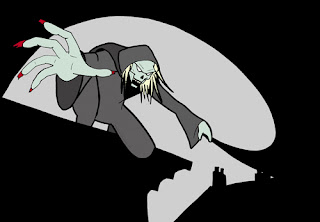
Also , you might like this, a short story by Matt Warrick and Gonzales, featured in Unknown Worlds of Science Fiction back in 1976.


Saturday, 2 April 2011

Fantasy Art Class Week 8 and 9 - 29th March 2011

I'm cramming two weeks into this blog post as I didn't have time to get last weeks posted.
Week 8 - 22nd March.
The purpose of this exercise was to to see what you had learned from the previous weeks exercises about composition, lighting and balance. A rough plotting guide was given  as a starting point (fig 1 and 2) and the rest was completely up your imagination.

fig.1


fig.2


Here are some of the results. I will post more as and when you submit them to me .


Drawn by Orazio
Nice character development, Orazio.


Drawn by Claire


Drawn by Jacqui
Nice Pirates of  the Caribbean feel to this one.


WEEK 9 - 29TH MARCH

We continue with the quick easy to draw exercises that should enable you to complete a piece of art, with spot colour, in just two hours.
It often helps to choose paper with an appropriate colour tone for the piece you are about to embark on.
For this piece, paper with warm earthy tones were chosen that would easily sit with the red spot colour that I had in mind. Red was chosen as I felt it would create the right atmosphere and tone. I wanted a kind of  aggressive war feel to it which was kind of inspired by the movies Conquest Of  The Planet Of The Apes and Battle For The  Planet Of The Apes.
Here's week 9's exercise  condensed to a select number of stages.
The  plotting stages are in black and white so that  they are easy to follow.

It may help to use a 9 panel grid to plot the composition


using simplified shapes, draw the main parts of the anatomy that will define the pose .


Identify the areas to be solid or  shaded before applying  ink.


A mid grey (in this case a  copic neutral gray 5 marker) has been used to make the contrast between the solid black and lighter tone less stark.


Finally, some highlights are added to help pull the character out from the background.