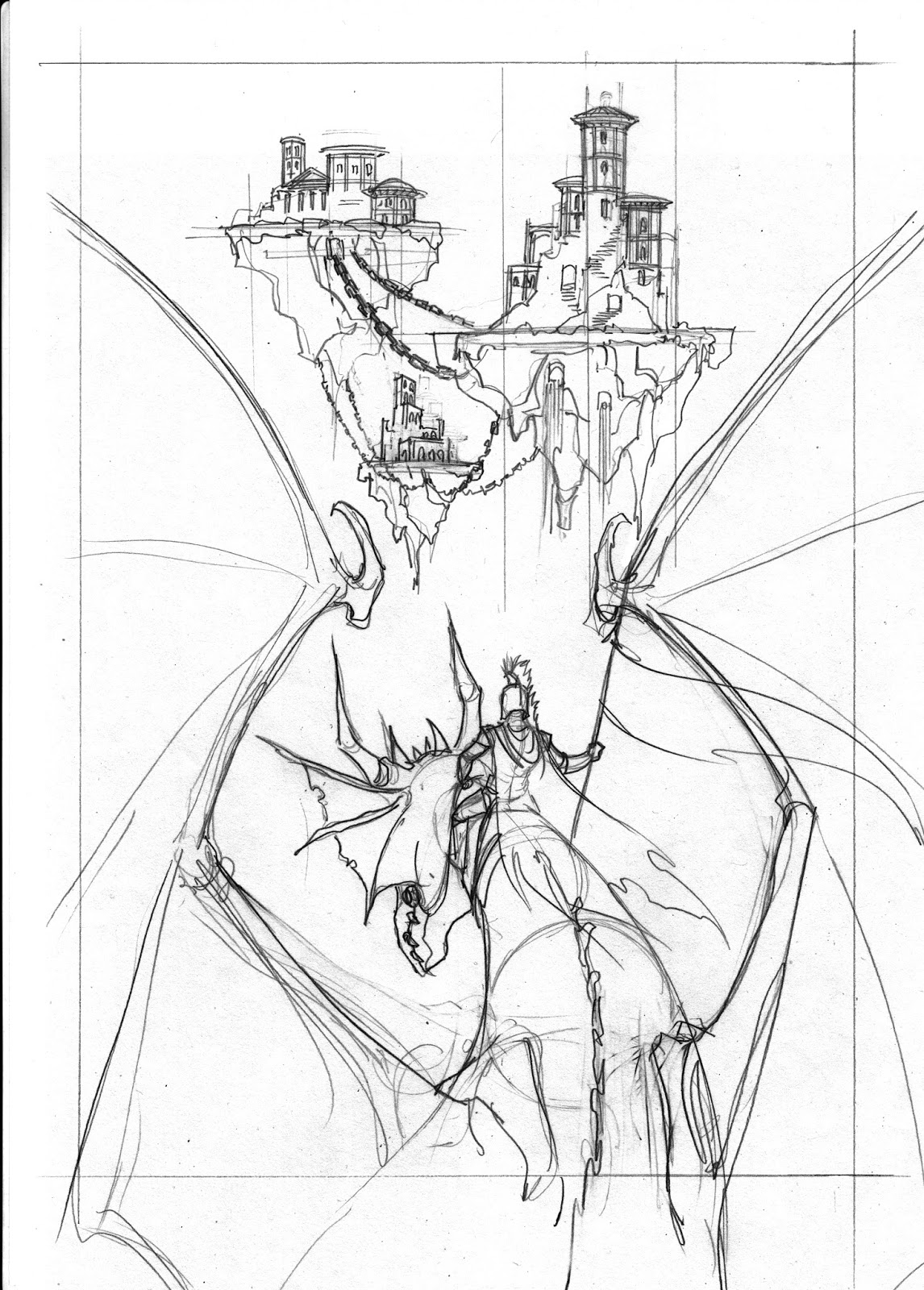
In the more recent exercises we have expanded from single figure drawing to adding background detail, whether that be scenery or purely background texture and lighting.
Here is a recap of the basics of composition we discussed in calss.
Please bare in mind that what I put forward here on this blog and in class, are based on my experiences of what I found to work successfully in my own work and also observed in other artist's work. This is by no meands to be held as a hard and fast rule to composition. Use it as a guide but also search for your own truth, your own way. Think for your self. It will be more rewarding than simply following every peice of advice I give. Put what I teach in class to the test. If you find fault with it, challenge me . Maybe I have something to learn too.
For the most part, the main thing to consider , is ballance. Does the drawing look ballanced. And if not, why not. Does the drawing lead yours, or the viewer's eye, to the main point of interest. Is your drawing communicating what you want it to. Always ask your self these questions with regards your work.
There is an old, tried and tested, theory, called, the rule of thirds . This is basically a grid comprising of nine parts.
There are four intersections
These intersections provide a guide for placing the main points of interest and creating interesting and ballanced composition.it is most often used for photography but it applies to illustration and most visual arts.
Here are a couple of examples.
Rather than just copy what I have read in books or online and reword it as if it were my own, here are some links that explain, in more detail, the rule of thirds.
However, also check this one out
http://petapixel.com/2016/01/30/10-myths-about-the-rule-of-thirds/
I tend to agree with Glover.
Just because a rule exists, does not mean that it is the only way. And I also think that rules are meant to be broken.
Art , in all it's forms,would be so very boring if everyone followed the same rules and never questioned them.
Tke a look at the following images by renowned artists. Does their work always follow the rule of thirds?
The Death Dealer by Frank frazetta
Chained by Frank Frazetta
The Barbarian by Frank Frazetta
By Simone Bianchi
By Adi Granov
Andrew Loomis
Bernie Wrightson
Boris Vallejo
Established rules are great as a foundation for learning but you don't have to let these rules stifle your creativity.