Thursday, 19 February 2015

JANUARY-MARCH TERM, WEEK 4:FIGURE DRAWING AND LAYOUT # 3

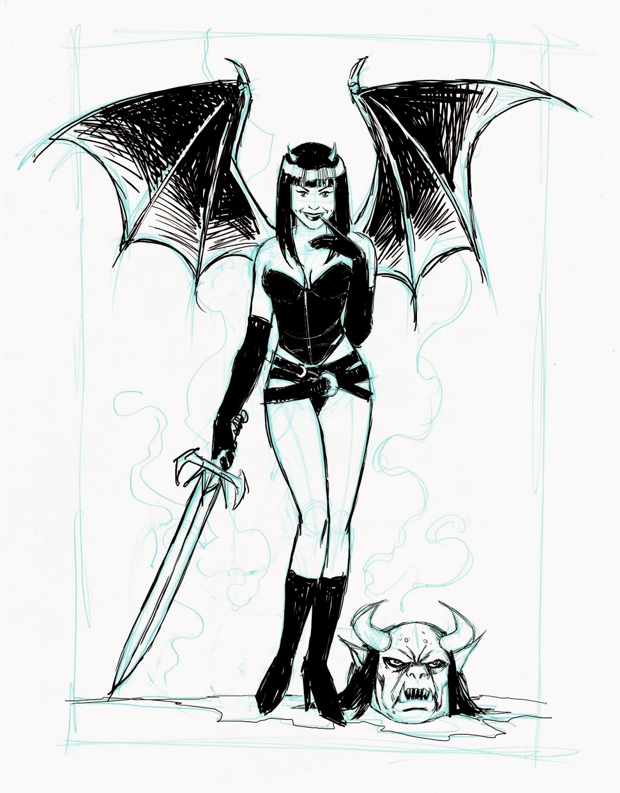
For those who would like  the stages of the tutorial  from this weeks class....

The original thumbnail sketches

What you are aiming for


The process


Or alternatively...

 This is a suggestion for colour


Tuesday, 17 February 2015

JANUARY-MARCH TERM, WEEK 3: IMPRESSIVE WORK

It was nice to witness some major breakthroughs, last week. Very encouraging.
He are some of the standout pieces.

Nice design, detail and  dynamics from, Eoine
Keep this up.


stunning work from Ann-Marie

Nice composition and colours from Richard.


Great progress from Mark in just 3 sessions

Monday, 16 February 2015

JANUARY-MARCH TERM, WEEK 3:FIGURE DRAWING AND LAYOUT#3

These images caught my eye last week, so I thought I would share them. They are really good examples of figure drawing and composition.

Really nice composition by Yishan Li

Adi Granov's figure work is always rock solid


We will look at some of  John Kenn Mortensen's work in class this week.

Friday, 13 February 2015

JANUARY-MARCH TERM, WEEK 3:FIGURE DRAWING AND LAYOUT#2

This simple exercise will continue to develop your figure drawing and also develop your eye for layout and composition, including how to apply  tonal definition.
The images shown were taken from the actual lession on a flip chart, so apologies in advance, if anything is unclear. Hopefully it will be.
What you are aiming for, is something like this but in your own style.

This is a rare occasion whre I kind of made it up as I went along but normally, I would bash a quick thumbnail out just to make sure I knew what I was doing.
It's not always necessary to produce thumbnail roughs of  you proposed work but I find it helps. But, each to there own.
I will probably do a post about preliminary rough work at a later date.
Here are the stages. I don't think I need to go into detailed descriptions on each one, I think it's pretty straight foward.

At this stage, notice  how I have left enough white around the solid black areas so that the shapes are not lost


Now it is time to think about finishing the drawing with a backgound. There are many ways you can crate a background and many techniques of application.
I will show you only two which are based on the same idea.

The first technique is to create a glow efferct around the fairy by using shaft lines. This is a much used technique, especially with black and white ink drawing, for drawing attention to the main point of focus of your drawing.
I have applied this rather quickly  and crudely with  marker pens but if you take you time and use  a decent ink pen or pencil, if you are doing a pencil drawing, you should be able to get a better result.
I went over the shaftlines with a correction pen to knock back and soften the linework around the fairy so that she stands out.

The second version is the same idea only with stippling. I was not using the right tool for the job here but it should  indicate the basic idea. Apply light stippling  in shaftlines around the fairy, and then apply heavier stippling with a thicker nib around the outsides.


Have a look at the tonal work of Virgil Finlay and Kelley Jones. This is the kind of thing I had in mind.
Virgil Finlay


Kelley Jones
Actually, this is very close to what I had in mind


Sunday, 8 February 2015

JANUARY-MARCH TERM, WEEK 2:FIGURE DRAWING AND LAYOUT

This exercise will continue to help you develop your figure drawing and also introduce you to basic framing of your subject.
We will progress on to more  challenging layouts later.

This is  the pre inked pencil drawing. This is what you are aiming for. Not necessarily my style of drawing but the figure.

Start by sketching out the figure. This is a centralised composition, so consider this when you begin.
If you find the stick figure helpful,  begin with that.

Or, if you find it easier to rougthly sketch out the figure, without using the stck frame,  begin that way.

I have drawn something pretty basic to follow, if you are confident  to draw some more elaborate, please do so.


I will post a more detailed  tutorial on drawing the face and hands but for now just have a go. Also, have a look back at what I wrote in my last post.

Not that you have drawn the figure, you can render it in ink or continue with pencil.
Now,  I must point out that I have not actually inked the following stages. These were very quickly (and crudely) gone over in photo shop but it should give you a few things to think about.

Think about how you want to render your drawing. It can tak  some time and many drawings befor you arrive at the style that is right for you..
You may prefer detailed  inking, or a combination of detailed line and graphic , solid black shapes.
If you are considering  a solid black background, think about whether it is important that parts of your main image  are lost to the background..
Below are some  suggestions  for finishing your drawing in a very simple manner.
You will notiuce I have switchd the axe for a sword

 I am not convinced that the black shape, to the right of the sword, dividing  the smoke, is working. I think it causes unnecessary conflict