
Saturday, 18 May 2013

APRIL/JULY 2013 WEEK3: MORE FIGURE DRAWING AND STUFF

Apologies for the absence on the blog, facebook and class. My health took a nose dive last week and I was able to fulfil either of those commitments.
So, I think we'll continue l with some of the basics  that you may find helpful before moving onto some  of the more advanced  exercises we will cover later during the course.
But, before that, one of the things I stress at the beginning of each term is, do not try and copy my style of drawing, but , just follow the process. Although I am competent at drawing, I would not call my self an expert.  I am simply passing on how I manage to put together the drawings I produce. I saw a post recently by  the highly acclaimed comic book artist Adi Granov, of which I will copy and paste the first paragraph here:   

The questions I get asked most often are about the tools I use. I dislike these questions not because I am keeping a secret, but because I feel that following my advice might lead people down the wrong paths. I change my process with every piece I do, I discover new things, or decide something isn't working, etc.; it's all a part of being an artist. It's a very fluid process, and rigidity and sticking to a specific tool will do more damage than good, especially to someone starting out. It shouldn't be about the tools, it should be about the knowledge and skill and personal preferences.

Adi, did actually continue the post with a detailed breakdown description of  a current piece of art .

I agree with those words. I learned to draw from reading comics and  mimicking  John Romita Sr., Gil Kane and Gene Colan, and then later learned that  I needed to start again and learn the basics. I was following another artists development and style without the foundations.

Here's another  thing, I'm not a great artist, I just happen to be able to draw better than my clients can. They employ me to do a job they do not have the time or inclination to learn, and for that I am fortunate.

So, to recap what we looked at in week 2 and 3:
Drawing the human head.
There are two basic ways of drawing the human head that I know of ( I have seen a few other approaches used but these are the ones I often use) and they involve  an oval or a sphere and a cube. The one I usually use by default is the oval.


I usually just draw the eyes in  and go for what feels right. If in doubt, divide the width of the face into 5 equal parts, this will  roughly give you the positioning for the eyes so that they are not too far apart or too near each other.
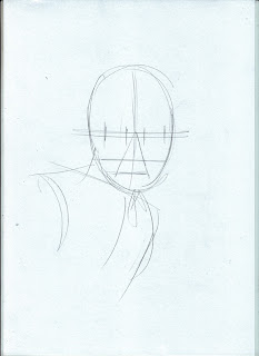


Notice that to gauge the width of the nose and mouth, I draw a rough triangular shape from the bridge of the nose.
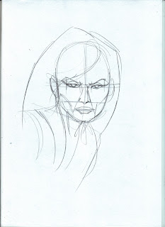


I always  go for uncomplicated shapes when drawing the hair. If  I try anything too complicated, initially, it always goes wrong.
 With all the  workings out still prominent, face is not looking attractive  and o bit on the harsh side.
Remove the guidelines and begin to soften the features , making the eyes, nose and mouth  prominent. Notice that I have reduced the amount of lines for the nose. I often find going too heavy with the line work for the nose can often age the look of the  character.


I adjusted the curves of the hair to what feels right to the eye. Well, my eye, at least.


I learned about  keeping the hair simple form watching Disney cartoons,


and later ,  by studying Bruce Timm's work.


Once you feel confident arranging the components that make up the face, try  capturing other ethnicity's by adjusting the eyes, nose and mouth, and jawline.


Another way of looking at constructing the human head is by using a sphere/ball shape and a cube.


The face in the first exercise above can be created using a sphere and  cube.  The eyes  positioned using the 5 equal space  sitting on  a line roughly halfway down the sphere.


As I mentioned  earlier, I keep to simple , uncomplicated shapes for the  hair.


This is how I  generally approach drawing the human head, but you don't have to take this as the only approach, there are plenty of books out there, for example:

Drawing the Human Head (Practical Art Books) by Burne Hogarth

Drawing the Head and Hands by Andrew Loomis


both of the above books are recommended. There are also some good  tutorials (as well as a lot of bad ones)  youtube. 
Whether or not you like David Finches style of drawing is irrelevant, his foundation work is solid.


One last thing I will leave you with until next time,  do not draw to impress others, draw to impress yourself.


Sunday, 28 April 2013

APRIL/JULY 2013 WEEK1:FIGURE DRAWING AND STUFF

A good start to the new term this week. I noticed some positive developments with some of you. Jake and Paul , the muscle definition in your figure drawing has improved. Good work.
However, I notice some of the old  habits creeping back in with  most of you, so I think another intense figure drawing session is in order.
Hellen and Abdulrahman, as first time students, I think your first drawings were actually very good. I picked up on your self doubt and frustration in the limitations of your current level of ability, but trust me, it WAS a very good start.

I think what will help not just Hellen and Abdulrahman, but all of you, is to practice loose, sketchy (scribbly , even) figure drawing  and try to caption form and movement. 
Below, is a sheet of loose sketches. The sketches are all various sizes, some complete and some full figure, but all that matters is that the figures have proportion and balance. 
 These were  drawn on an A4 sheet of paper. The sketches are quite small which means you can cram loads of drawings onto a sheet. Don't confuse this exercise with creating  nice pieces that you are going to hang on your wall, these are purely  a training exercise, in the same way an athlete will work out in the gym or test their technique on the track or court. This is how you perfect your drawing skills. And , hopefully, it should be fun doing it too.
One of the common flaws I see in a lot of students work is the off center leaning of their figure work. In most cases (though there will be exceptions to this) the figure must look centered and balanced  You should be able to spot the center line that balances the figure in just about every stance. Have a look at the sheet below and notice the red line indicating the center.
Notice the second figure from the left, swinging the sword.  Although he is stood on one leg, mid movement,the body is balanced over the the leg in contact with the ground. The body leans out towards the left in the direction of the swing of the blade but also curves back in to the right to counter-balance the swing action. In reality, if this were a stationary pose, the figure would surely fall over to the left, but as this is capturing a freeze frame of continuous movement, in reality, the majority of the action will momentarily  be on the left and follow through to the final thrust of action on the right. The central fiure with the axe  looks a little off center with both feet grounded, so I looked at making it a mid flight pose, with the rear, propelling leg being the only part of the figure grounded.
If you have time before the next class, have another attempt at this exercise.

Everytime I produce an exercise for the class, I begin by producing a collection of loose thumbnail sketches to arrive at a composition that I am happy with and that will also provide you, the students, with an exercise that is within your capabilities but at the same time wil push them forward.
Notice in the loose thumbnail I produced here that the figure is centered.

Notice in the figure below, the figure forms a triangular shape, further enforcing the balance of the sketch.


In the diagram below I have isolated the torso and the legs  in a very basic stripped down shape.


Adding the arms completes the figure.


Finally, I added some shading to identify the light and dark areas of the composition


When I drew the mushroom, I had the dancing mushrooms from, Walt Disney's Fantasia, in my head.


I saw Fantasia  at the cinema (I was just a child back then) back in the 60's and the visuals have stayed with me ever since and often find their way in to a lot of my work. 
Fantasia was among one of my first introductions  to fantasy art. I still think it is a magical movie to watch, even now.

Another point of reference for me is the master fantasy artist  Frank Frazetta.
Even if you are not particularly a fan of his work, studying his creative process to his paintings will surely give you  something to think about when creating your own work.
Below are some photos of a couple of books  currently available  focusing on Frazetta's creative process. In my opinion, these books are just as important, if not more, than a book such as ICON or LEGACY.

ROUGH WORK


SKETCH BOOK


 We may have a go at one of these later in the term.

Ok, that' all for now. I will try and post some links  to the best art shops before tuesdays class, so keep checking back.

PS.  Don't forget, we all have to start somewhere. I wasn't born being able to draw.


Sunday, 6 January 2013

NEW TERM OF FANTASY ART - NEW STUDENT ART


Swarthmore's Fantasy Art class will now start on Tuesday 15th January. There are some places available, so, if this is for you, Swarthmore are taking bookings on 0113 243 2210 or if you live nearby, pop in: Swarthmore Education Centre, 2 – 7 Woodhouse Square, Leeds LS3 1AD

Here are some more stand out pieces of art from the September/ December term. Not necessarily in order of preference of favouritism. 

 RICHARD STEAD
I really like these pieces by Richard. Nice layout, depth of field and dynamics.

 Really Pleased with Harvey's progress in only 20 hrs plus some time  in between.


 Technically this is not Rosie's best piece but for some reason I like it the most. It has a kind of David Lynchness about it.

Nice shapes from Orazio


Equally nice shapes form Dave